
Risk Index. Enhanced clarity of product
value and conversion.
Risk Index. Enhanced clarity of product value and conversion.
Before
After
Web platform for company risk evaluation, providing insights on debts, financial data, and registers, struggled to connect users with its core value.
Before
After
Web platform for company risk evaluation, providing insights on debts, financial data, and registers, struggled to connect users with its core value.
Initial challenge. Low engagement from the start and high drop-off rates highlighted the need for an engaging onboarding experience to guide users toward discovering the value of the product.
Initial challenge. Low engagement from the start and high drop-off rates highlighted the need for an engaging onboarding experience to guide users toward discovering the value of the product.
Unclear value proposition
Low conversion
What we did. We collaborated with the team to redesign the platform, clarify its value, and improve the experience before and after subscription purchase.
What we did. We collaborated with the team to redesign the platform, clarify its value, and improve the experience before and after subscription purchase.
Improved call-to-action placements in Freemium to drive conversion
Improved navigation and search to increase discoverability of key insights
Optimized information hierarchy to highlight key decision-making data
Redesigned a website to better communicate product value
Usability audit. We conducted a UX audit with the client, identifying key issues like unclear structure, lack of focus, and distracting elements that made it harder for users to navigate and understand the product.
Usability audit. We conducted a UX audit with the client, identifying key issues like unclear structure, lack of focus, and distracting elements that made it harder for users to navigate and understand the product.

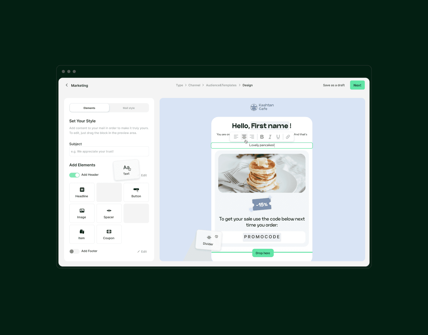
Visual conception search. Considering the audit, functional needs, and target audience, we iterated on conceptions. Together with client we chose a solution that balanced simplicity and functionality.
Visual conception search. Considering the audit, functional needs, and target audience, we iterated on conceptions. Together with client we chose a solution that balanced simplicity and functionality.
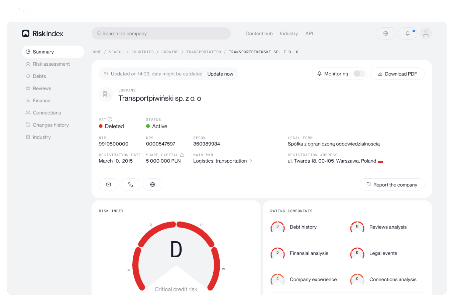
Report page. We chose Gauge chart, divided into risk grades: Critical, High, Moderate and Low, each using its own colour coding. We used the same type of chart to demonstrate the assessment of risk subcategories.
Report page. We chose Gauge chart, divided into risk grades: Critical, High, Moderate and Low, each using its own colour coding. We used the same type of chart to demonstrate the assessment of risk subcategories.


Introducing freemium. We introduced a freemium model that shows key data upfront, giving users a preview of valuable insights, which increased engagement and boosted conversion rates.
Introducing freemium. We introduced a freemium model that shows key data upfront, giving users a preview of valuable insights, which increased engagement and boosted conversion rates.

Debts pages. We enhanced company analysis with data visualizations, adding a step chart to track debt changes over time and bubble charts to show debt size and age at a glance. These visuals make complex financial data easier to interpret and compare.
Debts pages. We enhanced company analysis with data visualizations, adding a step chart to track debt changes over time and bubble charts to show debt size and age at a glance. These visuals make complex financial data easier to interpret and compare.


Reviews. We designed a solution for the AI feature to analyze reviews, highlight negative keywords, and summarize key issues. This helps users quickly identify risks, saving time and improving decision-making.
Reviews. We designed a solution for the AI feature to analyze reviews, highlight negative keywords, and summarize key issues. This helps users quickly identify risks, saving time and improving decision-making.

Financial indicators. We used a bar chart and temperature scale to show financial trends and industry comparisons, making risk assessment faster.
Financial indicators. We used a bar chart and temperature scale to show financial trends and industry comparisons, making risk assessment faster.


Connections. We used a network diagram to map relationships between companies and individuals, with filters for precise searches. This helps users uncover hidden links and assess potential risks more efficiently.
Connections. We used a network diagram to map relationships between companies and individuals, with filters for precise searches. This helps users uncover hidden links and assess potential risks more efficiently.

Changes history. We used a timeline with color coding to highlight key company changes and their impact, making it easier to track risks, past decisions, and structural shifts at a glance.
Changes history. We used a timeline with color coding to highlight key company changes and their impact, making it easier to track risks, past decisions, and structural shifts at a glance.

Search page. We used cards to highlight key company details for quick scanning and placed filters in a sidebar for easy access. This speeds up decision-making and helps users find relevant companies faster.
Search page. We used cards to highlight key company details for quick scanning and placed filters in a sidebar for easy access. This speeds up decision-making and helps users find relevant companies faster.


Navigation. Internal navigation follows a table of contents pattern, allowing users to quickly scroll through sections. This keeps the full report accessible while making it easier to locate key details quickly.
Navigation. Internal navigation follows a table of contents pattern, allowing users to quickly scroll through sections. This keeps the full report accessible while making it easier to locate key details quickly.
Website. We designed an external website to clearly present Risk Index, its value, and key features. Along with the homepage, we explained the API and created a blog to enhance engagement and credibility.
Website.. We designed an external website for the platform, telling you what the Risk Index is all about. In addition to the homepage, we also explained more about the API and designed the company's blog.
Polishing. We designed all required screens and components to ensure a cohesive experience and future scalability, making the system more robust and adaptable as the platform grows.
Polishing. We designed all required screens and components to ensure a cohesive experience and future scalability, making the system more robust and adaptable as the platform grows.

Mobile. We adapted every screen and flow, including charts and complex tables, to ensure a seamless mobile experience, making the platform accessible and easy to use on any device.
Mobile. We adapted every screen and flow, including charts and complex tables, to ensure a seamless mobile experience, making the platform accessible and easy to use on any device.

Result. Subscription conversions and LTV are increasing, reflecting the impact of a clearer value proposition and a more intuitive user experience that improves engagement and decision-making.
Result. Subscription conversions and LTV are increasing, reflecting the impact of a clearer value proposition and a more intuitive user experience that improves engagement and decision-making.
Strengthened the freemium model by giving users a preview of key data
Enhanced clarity of product value with intuitive data visualizations
Project team
Project team

Stanisław Pierov
CEO

Kamil Maksymowicz
COO

Vadym Oliinyk
Product Designer

Veronika Bogush
Project Manager

Liliya Kizlaitis
Design Consultant

Artem Ivanov
Design Consultant


© Other Land LLC
© Other Land LLC