Why AI-generated products look generic, and what designers do differently
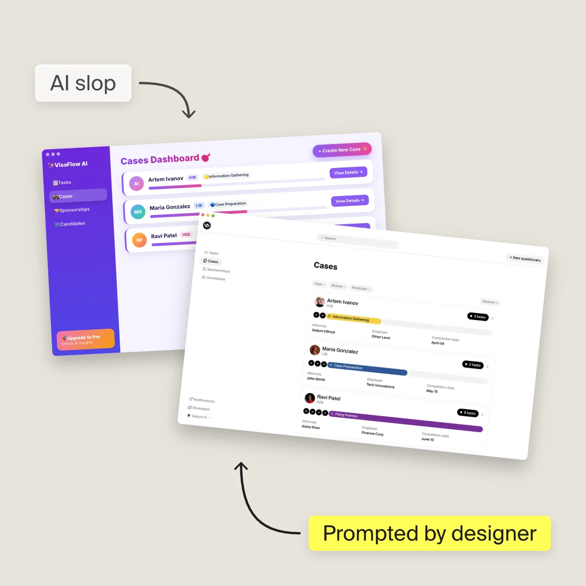
Not because AI made it. Because the first output was treated as the last one.

Key takeaways
- AI-built products look generic because the first generated output ships as the product, not because AI made it.
- A slow development queue used to buy weeks for a second look. Generation removed that step and nothing replaced it.
- Built feature by feature, the same decision, like how errors or empty states look, gets answered differently on every screen.
- Designers decide each pattern once, write it down where your tools can read it, and review what shipped instead of slowing the pipeline.
Your product works. Every screen renders, the flows go where they should, and nothing is obviously broken. And yet it looks like a demo, and you cannot point at the reason.
The usual explanation is that AI made it, and AI output looks like AI output. That is not quite right. Plenty of products are generated end to end and do not look generated. The difference is not the tool and it is not the prompt.
It is what happens to the output after it appears.
In a team that ships mature-looking work, generated output is a draft. It goes into a system, gets a name and a place and a set of rules, and only then becomes part of the product. In a product that looks cheap, generated output is the product. The first version is the final version, because nothing in the process ever asked for a second one.
You lost a safety net and nobody told you
Here is what changed and why it caught everyone off guard.
When building was slow, the development queue did something nobody credited it for. It put weeks between “we decided this” and “this is live.” In those weeks you looked at the thing again. Someone said the empty state feels wrong. Someone noticed two screens handled the same error differently. The delay was annoying and it was also free quality control.
Generation removed the delay. What it did not do is replace the function of the delay. So now there is nothing between the first output and the shipped product except your own judgment, applied in the moment, at speed, usually while you are thinking about something else.
That is the actual mechanism behind “it looks generic.” Not bad taste. A missing step.
Works and done are different states
The smallest version of this is easy to see.
Take a date picker in a generated product. It opens, it selects a date, it closes, the value saves. If you are a founder looking at it, it is done. There is nothing to report.
A designer looking at the same component sees an unfinished thing: what happens on the edges of a month, what the keyboard does, how a disabled range reads, whether it matches the other inputs on the same form. None of that is broken. It is just not decided.
One date picker does not matter. Forty components in that state is what people mean when they say a product feels cheap. They are not seeing any single flaw. They are seeing the accumulation of things nobody finished deciding.
The same question, answered forty times
The bigger version of the problem is structural, and it is the one that quietly makes products unusable.
Generation happens one feature at a time. Each prompt is about a part. So each part answers the shared questions on its own, from scratch, with no memory of how the last one answered them.
Take failure. Something goes wrong on a screen. Does the user get a small inline message, a toast, a banner across the top, or a full page with a support contact? There is a right answer, and it depends on how bad the failure is and what the user was in the middle of. It is one decision, made once, applied everywhere.
Generate feature by feature and it gets decided forty separate times. Every screen picks something reasonable in isolation. Nothing looks wrong on its own. But the user, moving through the product, is being taught a different language on every screen, and they never learn to read any of it. What they experience is not “this is ugly.” It is “I do not trust this.”
The same thing happens with empty states, confirmations, loading, how you name things, what a primary action looks like. All of it locally fine. None of it agreeing.
You cannot prompt your way out of this, because the problem is not in any prompt. It is in the space between them.
A team that generates everything
We work with Orbox, an AI-native platform being built for the Dubai real estate market. Their agent fleet builds the product. Their engineer does not write code by hand. A feature can go from specification to deployed overnight.
By the logic of “AI products look generated,” this should be the worst-looking product in the category.
It is not, and the reason is dull. Before a designer joined, the product had a set of AI-generated components. They worked. They also had no naming conventions and no consistency underneath them, which meant every new feature had to reinvent whatever it needed. The set could not grow. It could only get bigger.
Rebuilding that into an actual system was most of the first month, and the important part is what the system is: not a folder of screens, but the decided answers. The error hierarchy. What each state looks like. Which patterns exist so that new work assembles from them instead of inventing alongside them.
Generation still does the producing. It just produces against something now.
What designers actually do differently
Strip away the craft language and it comes down to a few habits, none of which are about drawing.
They can tell a standard answer from a right one.
A model returns the most common solution to the pattern it recognises. That solution is usually reasonable, and every so often it is precisely wrong for your product, in a way that reads as perfectly normal until users hit it. Telling those two apart is not taste. It comes from having watched the same patterns succeed and fail in real products over years, most of that before anything was generated. It is also the part that does not transfer into a prompt, because you cannot ask for the exception if you do not know it exists.
They treat the first output as a question.
Not a bad output, a first one. The instinct that matters is asking what this would look like if it had to sit next to everything else, and that instinct is what disappears when you are moving fast and the thing in front of you already works.
They decide once and write it down.
The valuable output is not the screen, it is the rule the screen follows. A rule keeps applying after they stop looking. A screen does not.
They rebuild the gap that speed removed.
Not by slowing the pipeline down, which would give back everything agents bought you. By putting the check somewhere that does not block: reviewing what shipped rather than what was proposed, fixing at the component level so one fix lands everywhere.
If you are looking at your own product right now
Two things you can do this week, neither of which requires hiring anyone.
-
Open five screens from five different features side by side. Not one at a time, all at once. Look at how each one handles an error, an empty state, and its main button. If they disagree, you have found what is making the product feel cheap, and it is not the visual design.
-
Then pick the one pattern that appears most often across your product and decide it properly, once. Write the decision down somewhere your tools can read. Every future generation gets better for free, and you will have done the thing that separates a product that happens to be generated from one that looks it.
If you would rather not do that yourself, that is roughly what we do. But the diagnosis is worth having either way.