Telecom. Keeping up with rapid growth with scalable design systems.
Initial challenge.
Steady growth created a need for additional design support. The product struggled with inconsistent design and inefficient user flows, leading to user frustration.
What we did.
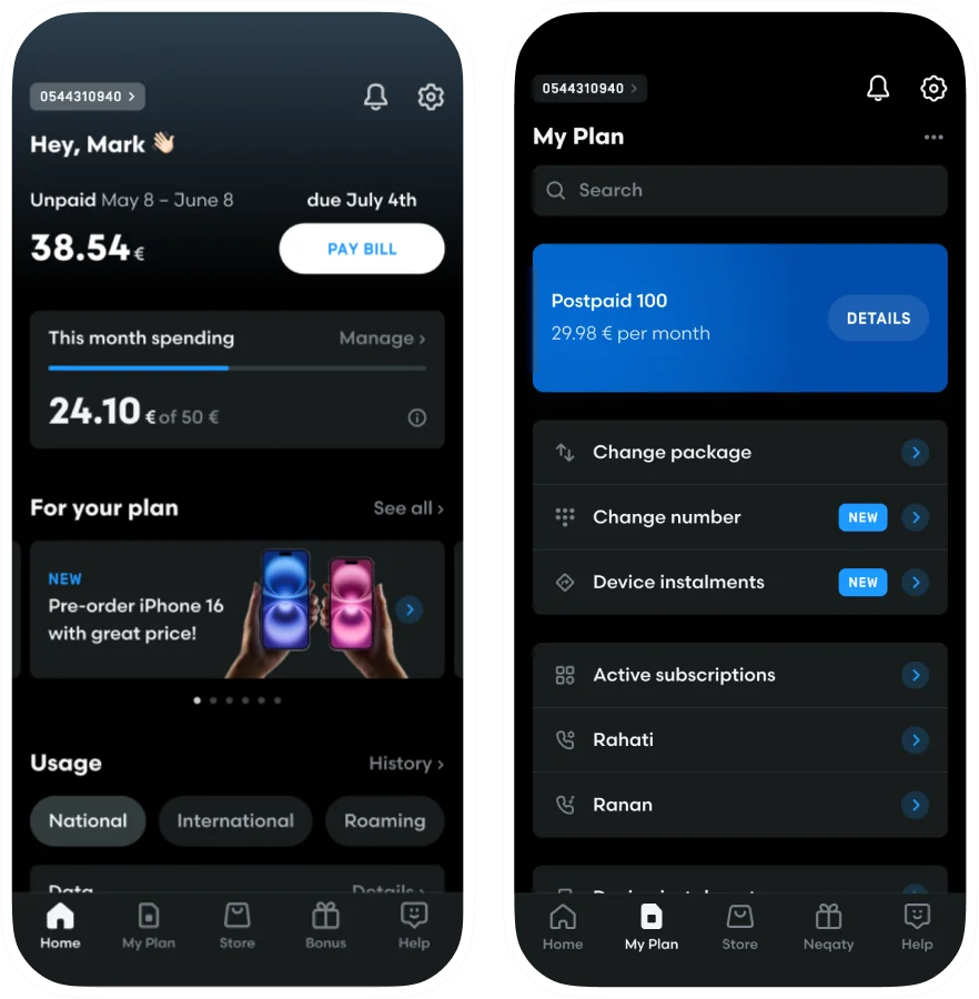
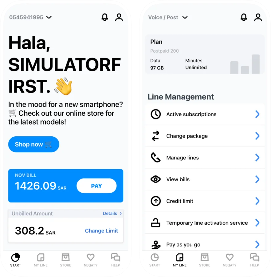
We optimized user flows, refreshed the visual style, and reduced the time needed for regular actions. Our design team delivered scalable design system for Latin and Arabic.
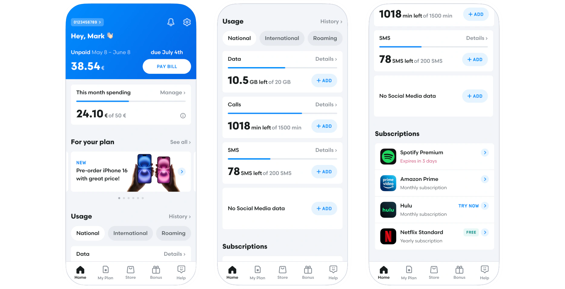
Home page with a premium mode.
We improved the main screen hierarchy, making key data and actions easily accessible. Premium mode, exclusive to certain plans, adds value and enhances the experience.
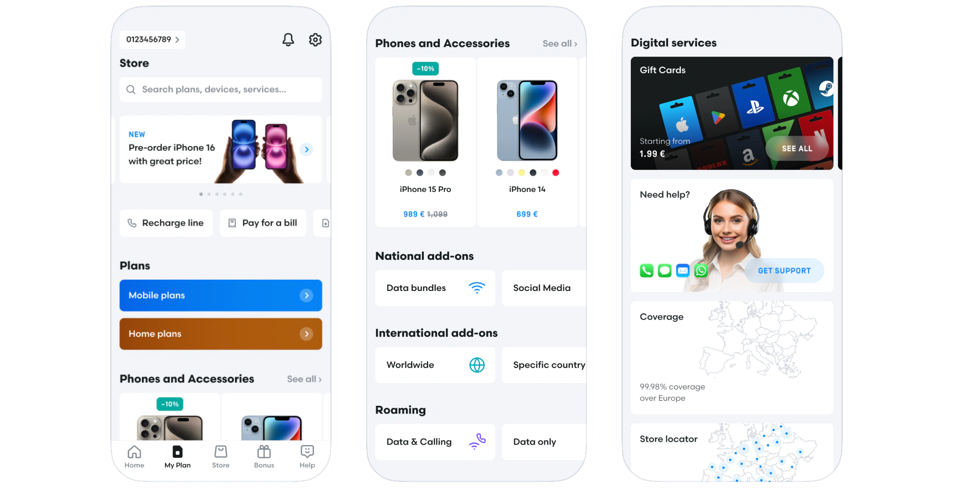
Store redesign.
As a key cash-flow source, the store needed a new visual hierarchy to help users quickly find what they need. The redesign aimed to streamline the experience by making purchasing decisions faster.
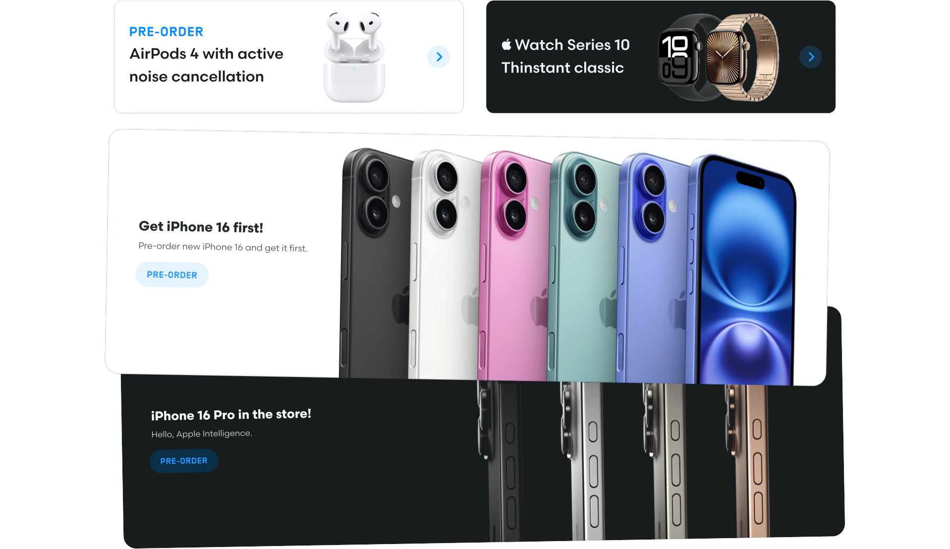
Store banner maker.
We kept scalability in mind and created a simple solution that gives banners a consistent yet unique look. It allows the marketing team to easily create flexible and clear messages.
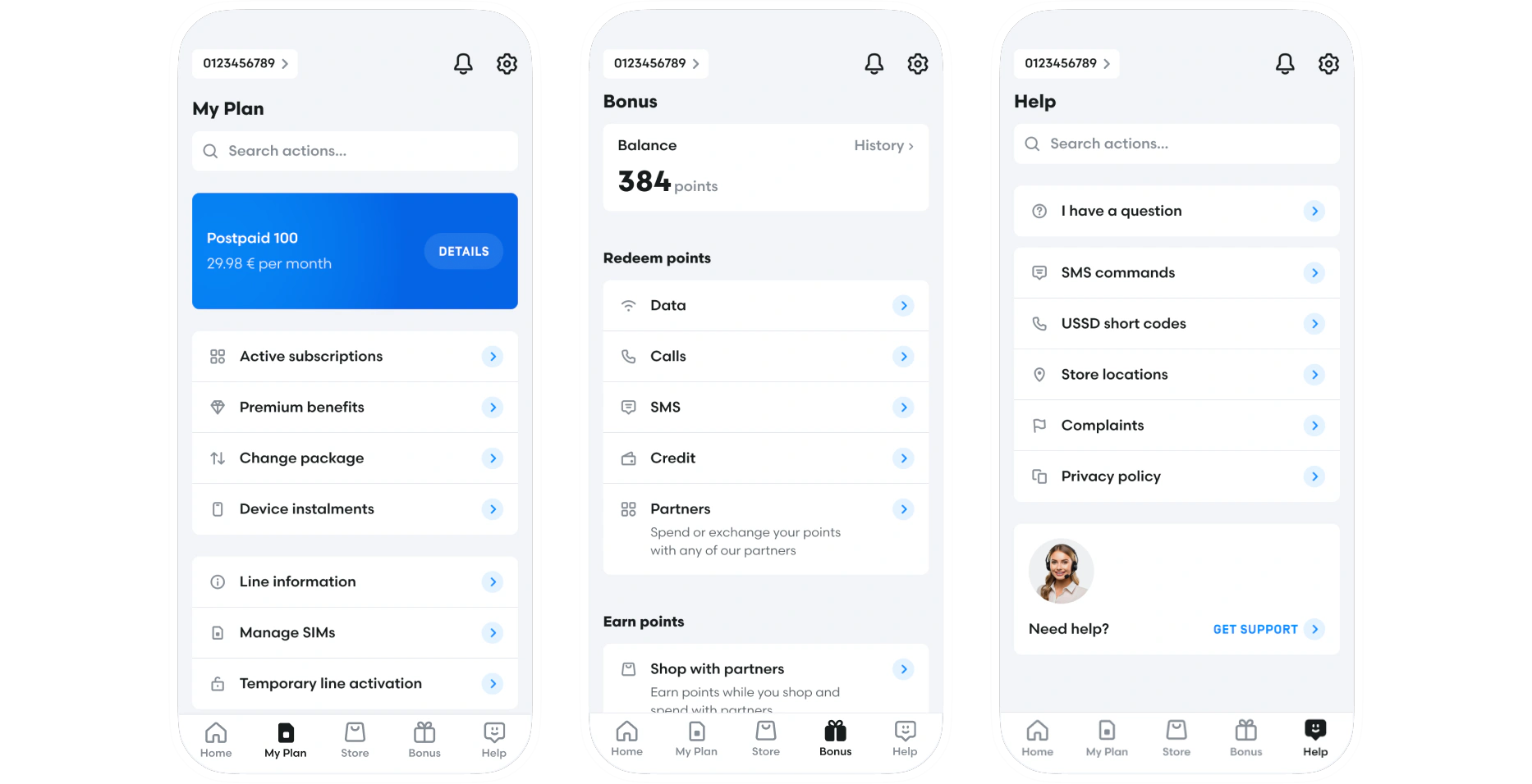
Redesign of additional pages.
We updated the pages to match the new visual style and changed the action order to fit the most common user needs.
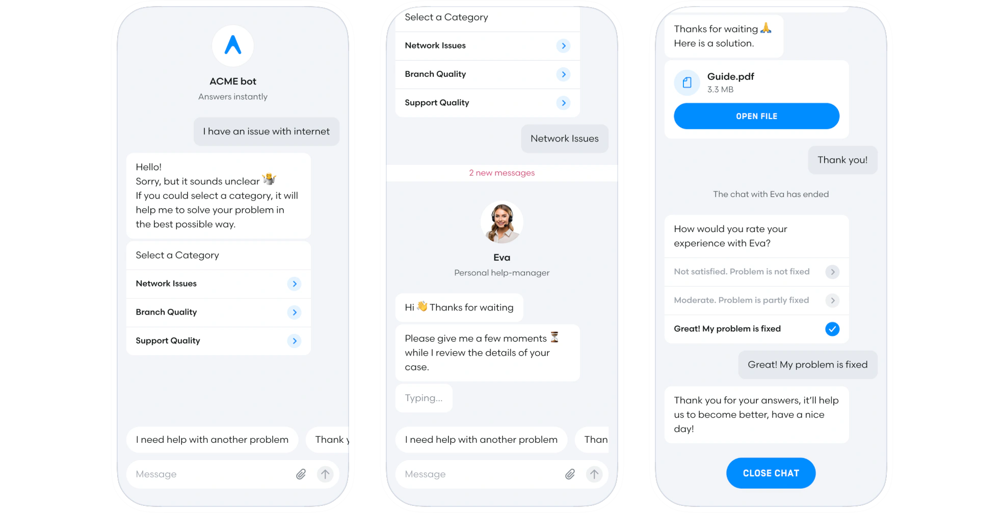
Introducing chatbot.
We designed a structured chatbot to help users quickly resolve their issues, reducing the load on customer support and improving efficiency.
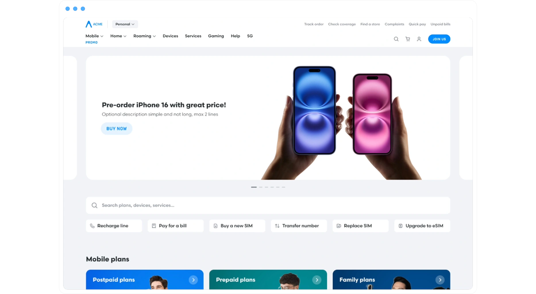
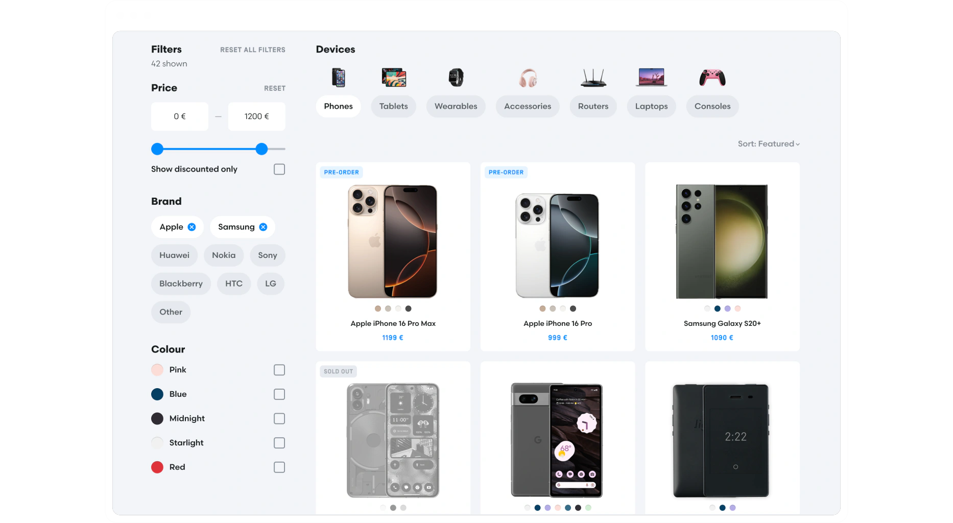
Desktop store page.
Most users use mobile app, but a desktop version is still in high demand. We adapted the mobile app solution to the desktop website, keeping in mind scalability and specific web use cases.
Desktop e-commerce pages.
Store website required unique flow design based on best practices to increase conversion. We redesigned the main flows to optimise purchase flow.
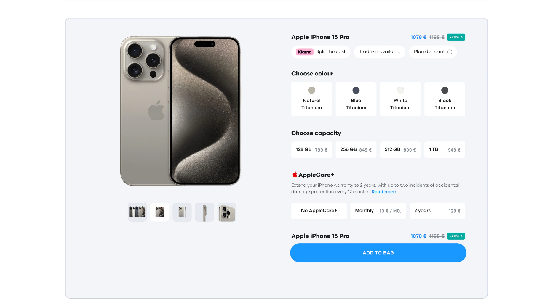
One product page.
We optimized the desktop UX with a compact, guided configuration flow, simplifying selection, navigation between different types of the same product, and checkout.
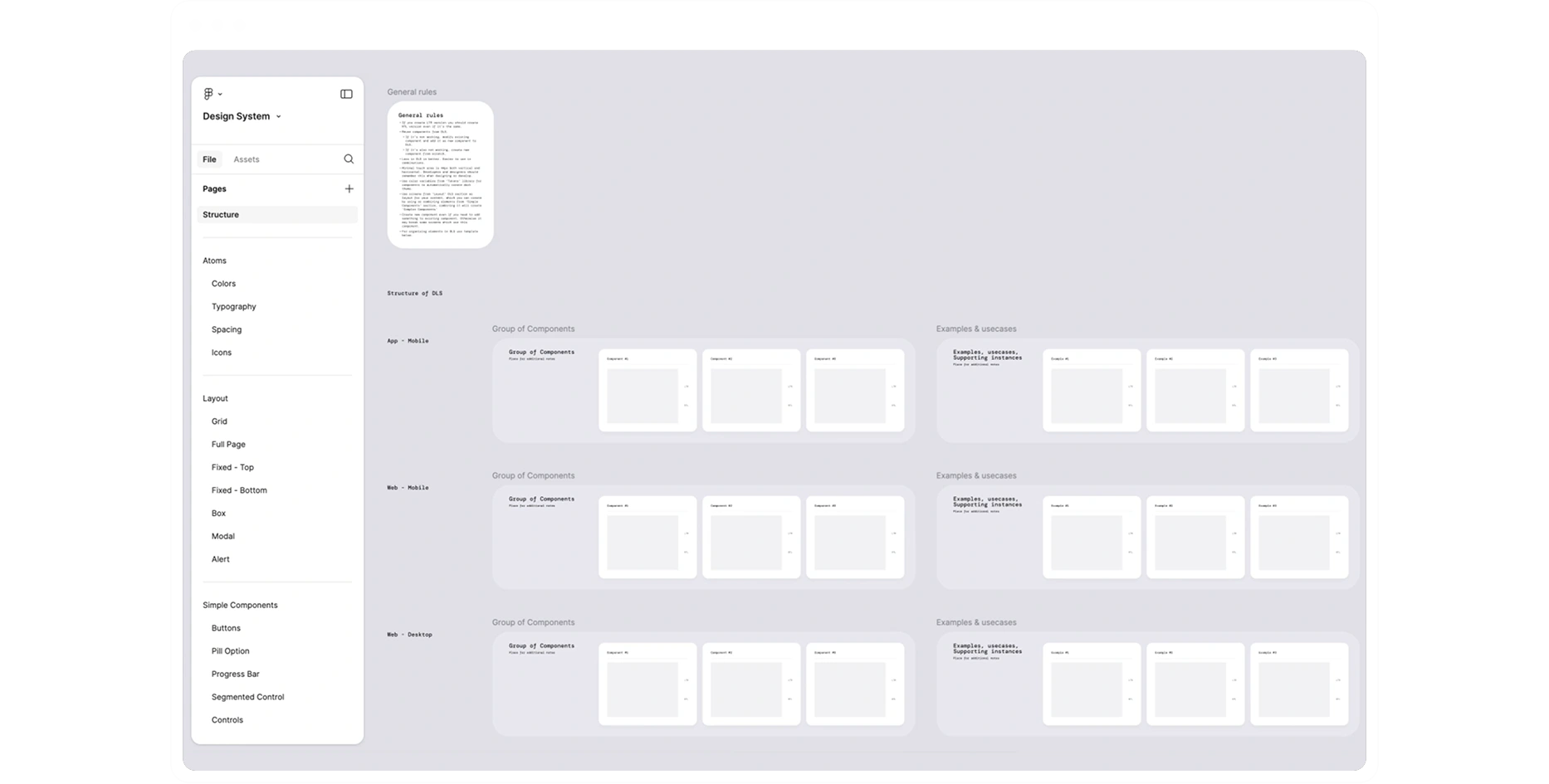
Building a new design system.
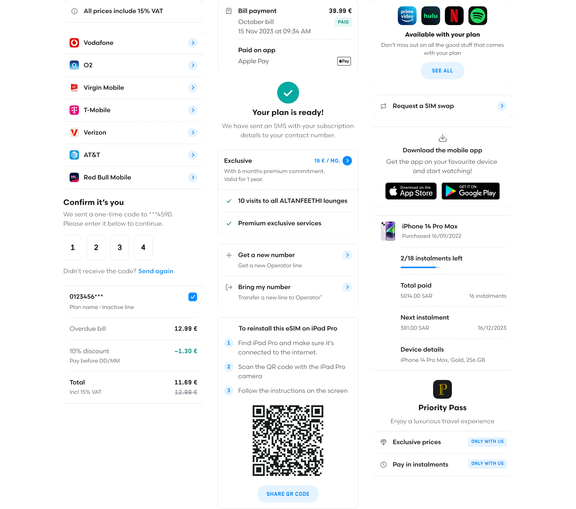
We built a new system focused on simplicity and efficiency, ensuring consistency across the app. New solution supports dark/light themes and Arabic/Latin languages.
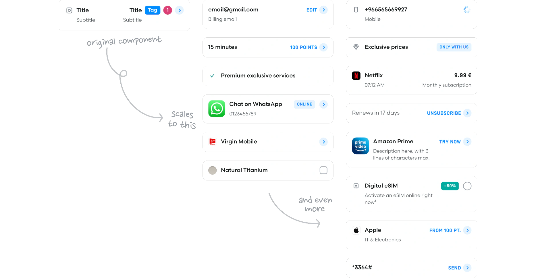
Reducing the number of components.
We simplified the system by reducing components and introducing flexible solutions, like a single list component for all list use cases in the app.
Scaling design system.
With an optimal number of components, we improved half of a very complex mobile app and handed over the project, enabling the internal design team to use and scale the app further.
Result.
We streamlined key user flows, improved the visual consistency, and reduced friction in completing tasks. The new scalable design system ensures efficiency, consistency and faster feature deployment.